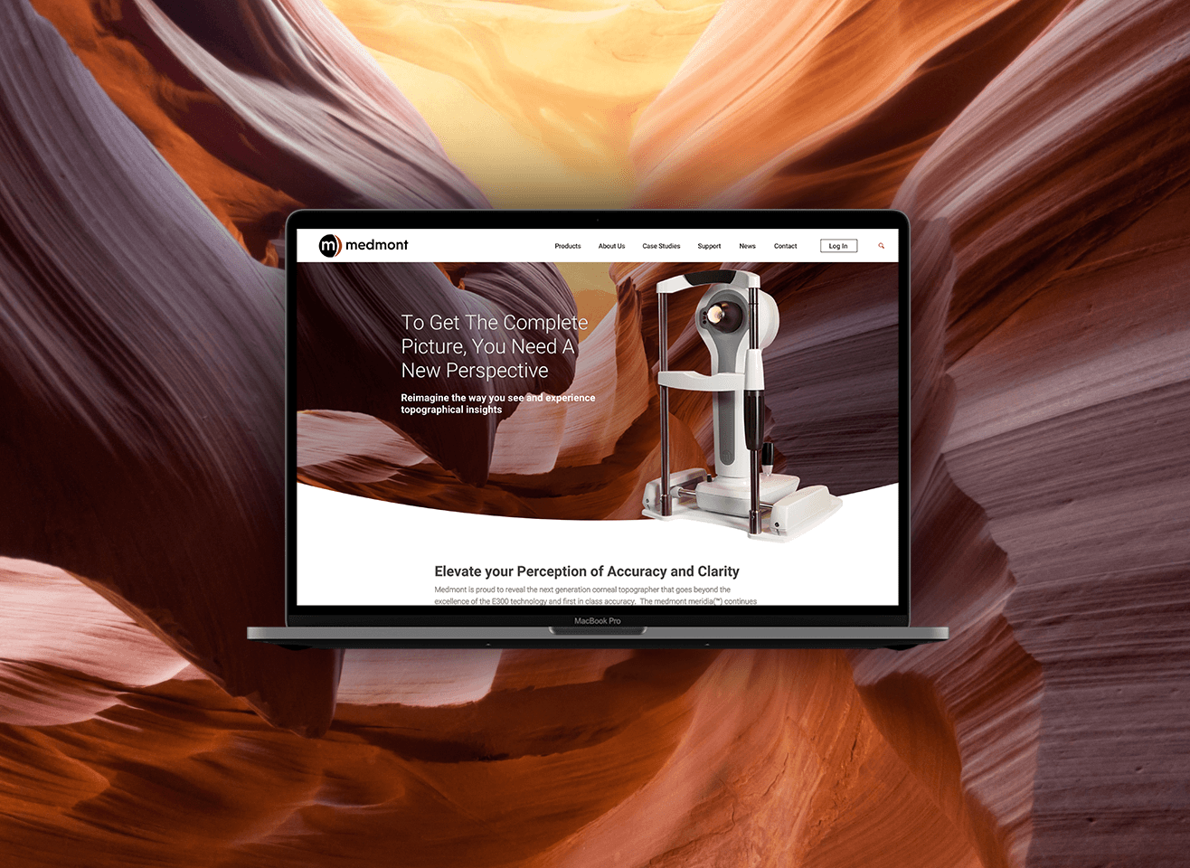
For the logo design, less is more. Removing the dated 3D effects and updating the font made their logo feel fresh and comtemporary. Starting with a revamped site architecture and site map, I then completed a full set of wireframes to establish the new information hierarchy.

